The Challenge : A brand playbook nobody had used yet
Azar had just written a new brand playbook, but it had never been applied to anything real. The old App Store screens walked through features one by one, mostly UI captures on gradient backgrounds. You could see what the app did, but not who you would meet there. The Italy campaign was launching on the App Store, web, in-app and streaming ads all at once. Without one shared visual standard, the same campaign would have looked like five different brands. My first job was turning the playbook into something that worked on real screens.
Directing a shoot in Italy from Seoul
A local production team ran the shoot in Italy. I couldn't be on set, so the direction had to live on paper. I built a reference document with two concepts covering background, framing and the kind of expressions we wanted, and mapped which concept would feed which format. Pairing every note with reference images left very little room for misreading, and it turned out to be the most reliable way to work across time zones.
When the footage came back, I cut it into 6 second ads. At that length every frame counts, so I made several versions, adjusting cut lengths and subtitle timing until the hook and the logo landed cleanly.

Shoot Reference: Concepts A and B, with expression references

6s Cuts: Edited by me from the shoot footage, with Italian subtitles
TV Spot 15s: Produced by the agency in Italy. I helped select the final cuts and reviewed the app UI details
App Store / Web / Splash
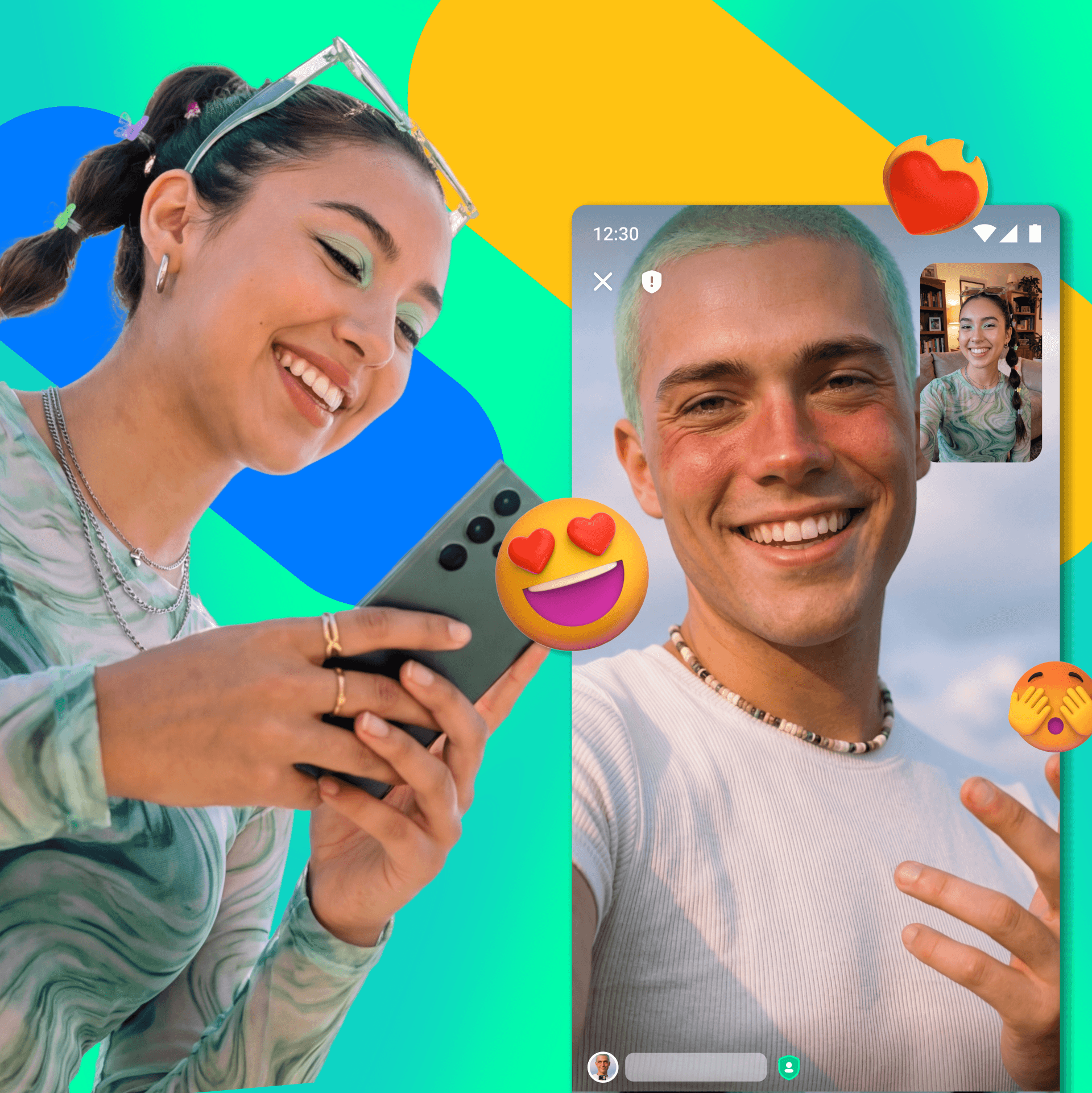
I reorganized the App Store screenshots around people instead of features: dog lovers, music nerds, gym goers, beauty fans. Each screen shows someone you could see yourself in, and the set closes on the campaign line.
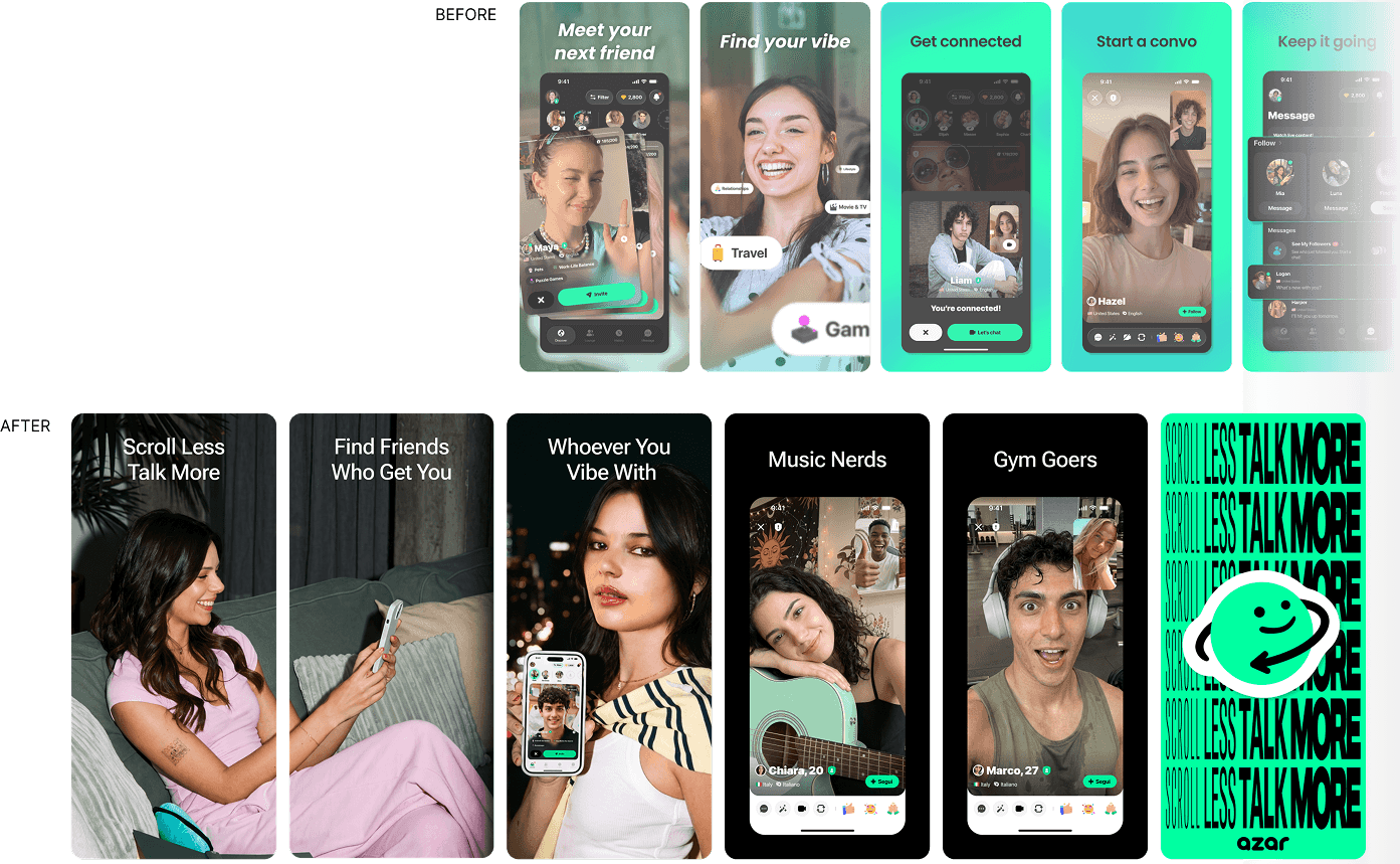
The same faces and tone carry into the web link preview and the app's splash screen, so the first impression stays the same wherever someone comes in.
App Store event images get cropped differently in search results and on the product page. I tested them in mockups of the real store and adjusted the layout and text until they read well in both.

Netflix Pause Ads
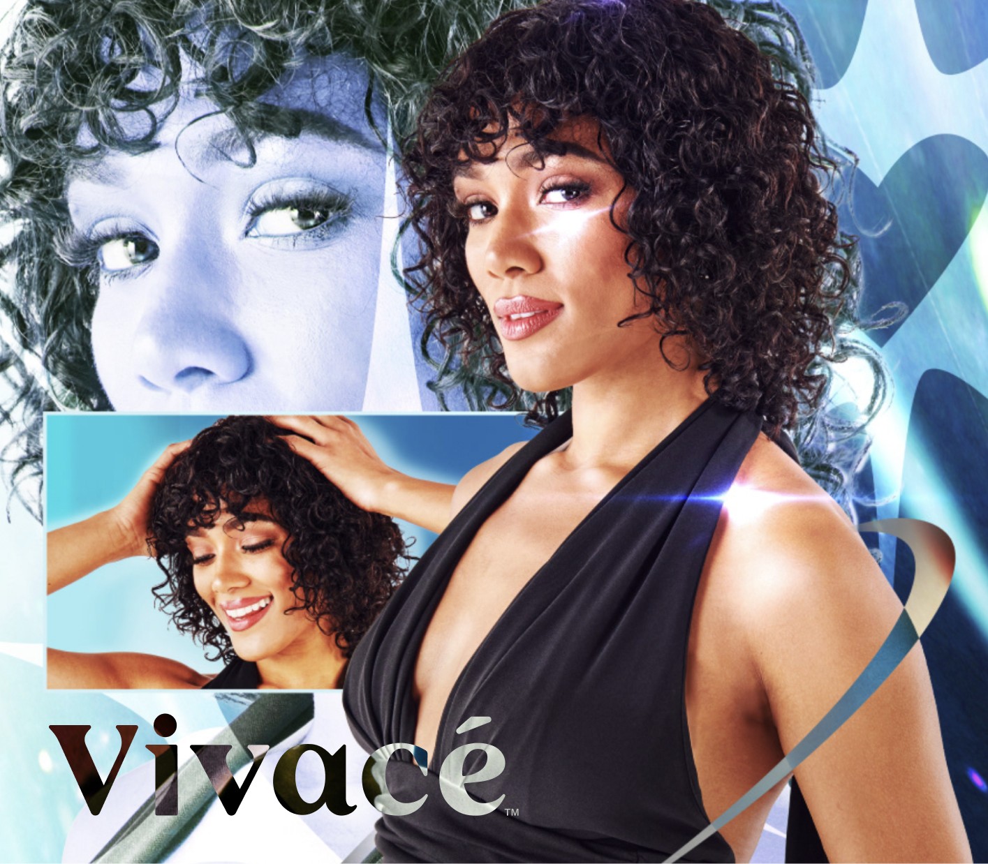
These ads fill the screen the moment someone pauses a show. Too loud and it feels like an interruption, too quiet and nobody notices. I locked the logo and the line in place and changed only the model's framing and the background tone, so the three versions read as one campaign and don't get tiring on repeat.
Nobody opens Netflix looking for us. So the goal was : be recognized, not explain.

In-app Communication
For the summer challenge, I made a notice modal, a notification banner icon, an inbox message and the Help Center header. Each one has its own size and context: the icon keeps only the key object on a transparent background, while the modal carries a lot of information and still has to read at a glance. I rebuilt the same visual for each spec and reshuffled the hierarchy so it reads as the same campaign on every screen.

Reflection
Direction has to work without me in the room. I couldn't be on set, so everything I wanted had to be on the page. Pairing each note with a reference image taught me that a clear brief does more than being there in person. It is how I would approach any remote production now.
Consistency comes from what you lock, not what you repeat. Across more than a dozen formats, I kept only a few things fixed: the faces, the line, the logo position. Everything else could bend to fit the screen. That small set of rules is what made the campaign feel like one piece.