Overview
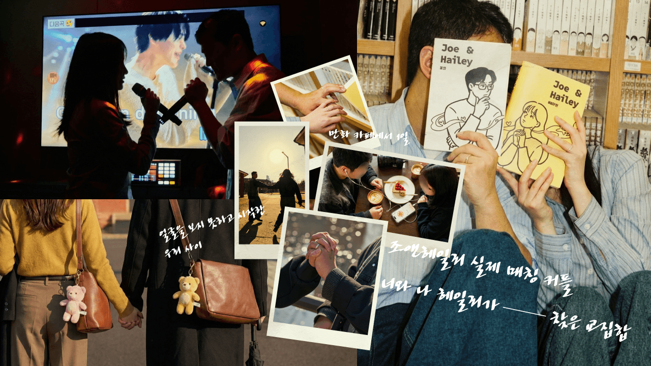
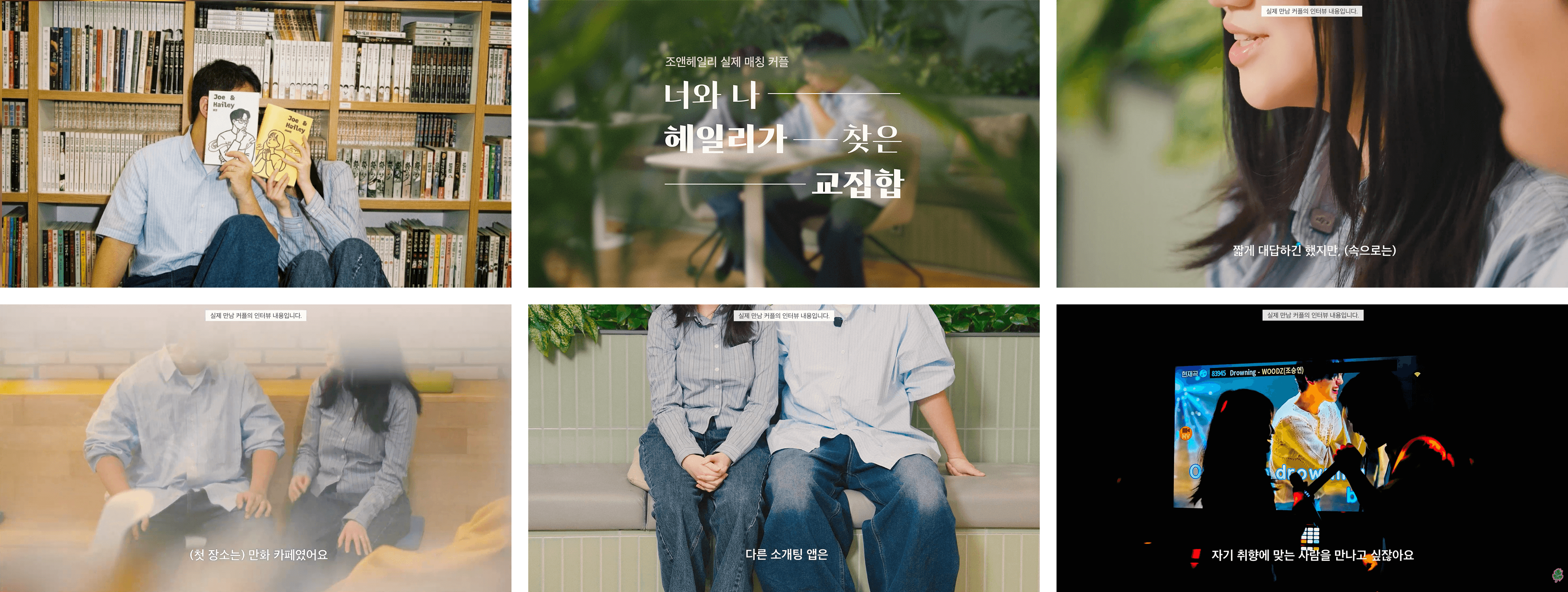
Joe & Hailey is an AI dating service for women tired of disposable swipe culture. For its "Slow Romance" campaign I helped build the brand's core visual system, then applied it to the app's real first matched couple, who refused to show their faces. Rather than let anonymity turn the film into a true-crime documentary, I designed custom branded book covers the couple could hide behind, solving privacy, copyright, and brand integration in a single move.
The Brand Foundation
"Why should a brand built on cutting-edge AI feel like a warm, analog scrapbook?" Before execution, I helped define Brand Book 2026, the strategic standard for every visual decision that followed:
Brand value: 'Slow' in a fast world. The meeting is slow, but the time together feels suspended.
Visual system: core color 'Buttermilk' (
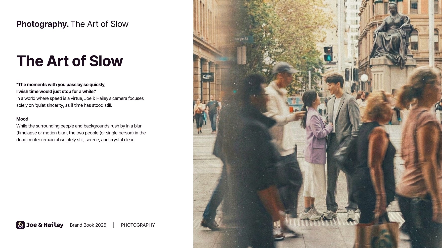
#FFF1B5); a warm, sunlit palette replacing the cold digital feel of a standard app.Core logic: 'The Art of Slow.' The world runs in motion blur; only the couple stays sharp and still, a 'Frozen Moment.'
Photography rule: 'Focus: Beyond the Face.' Faceless cuts and intimate details shift judgment from appearance to authenticity.


The Constraint
The campaign centered on the app's 100% real first-matched couple. But there was a decisive constraint: the couple refused to show their faces. Standard anonymization, heavy shadow, blur, reads dark and "thriller documentary," the exact opposite of the 'slow romance' the brand stands for.
Reference research & visual strategy
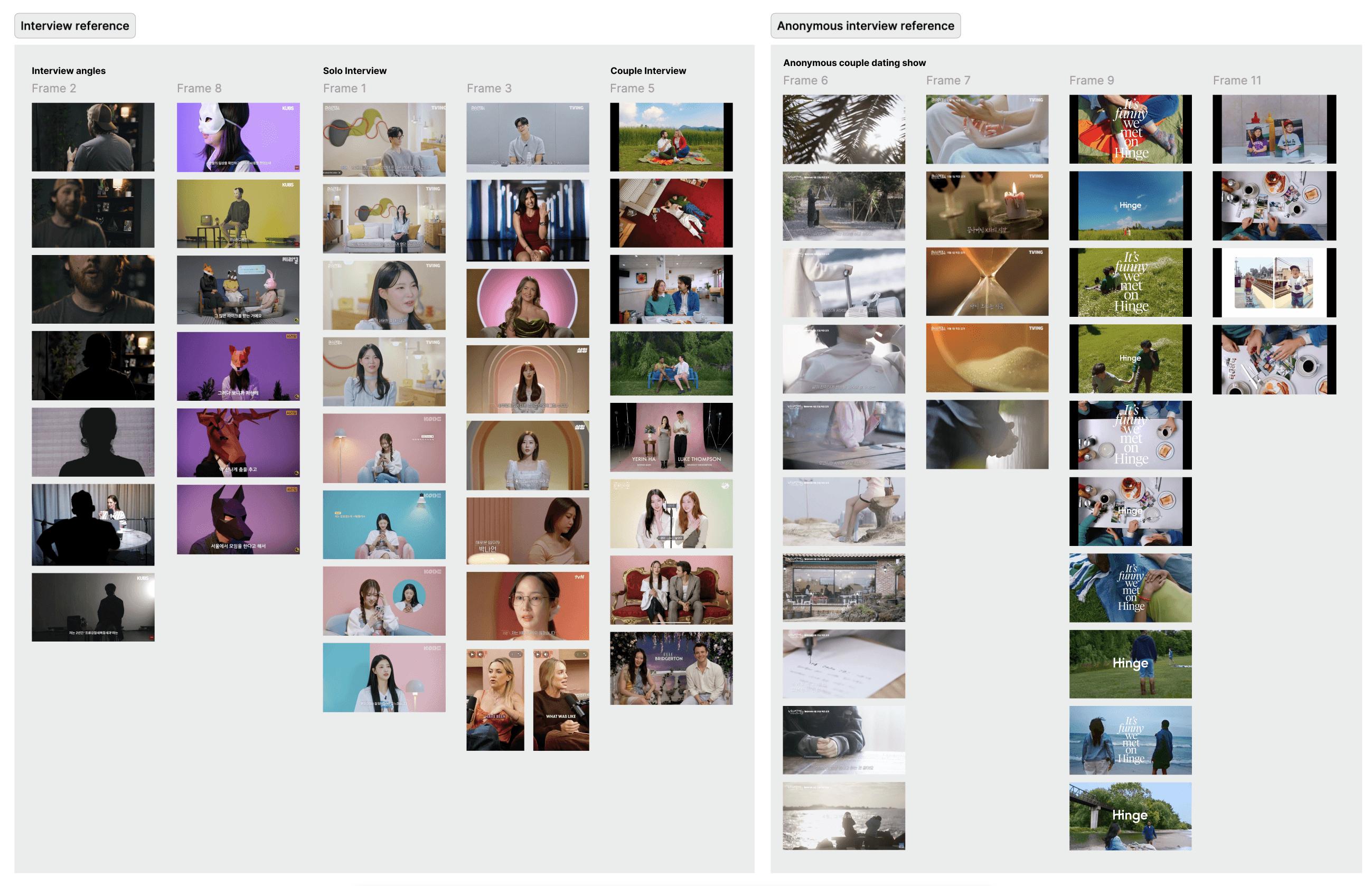
I analyzed standard dating shows, but hiding faces instantly killed the romantic mood. So I studied "anonymous interview" framing techniques, drawing heavy inspiration from the cinematic, intimate trailer of the GL dating show Your Romance (너의 연애). The goal: keep a dating show vibe, but elevate it into something cinematic and intimate rather than a "true-crime" documentary.
The Craft: prop design as a brand shield
In deep pre-interviews I found the romantic hook: their first date was a manhwa (comic) café, where they were so absorbed in each other they never opened a single book. I translated the brand's scrapbook aesthetic into a physical asset, I illustrated and designed the 'Joe & Hailey' branded book covers myself, and by wrapping real books with them, the couple could playfully hide their faces behind the brand.
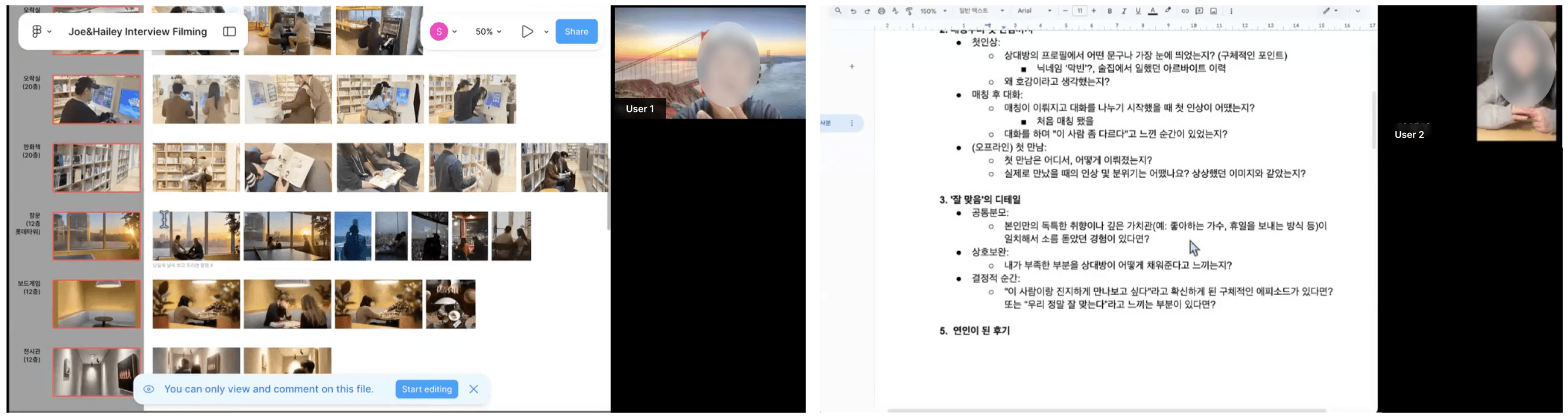
One solution solved three problems at once:
protects the subjects' privacy,
avoids the café's IP / copyright issues,
folds the brand character directly into the real world narrative.
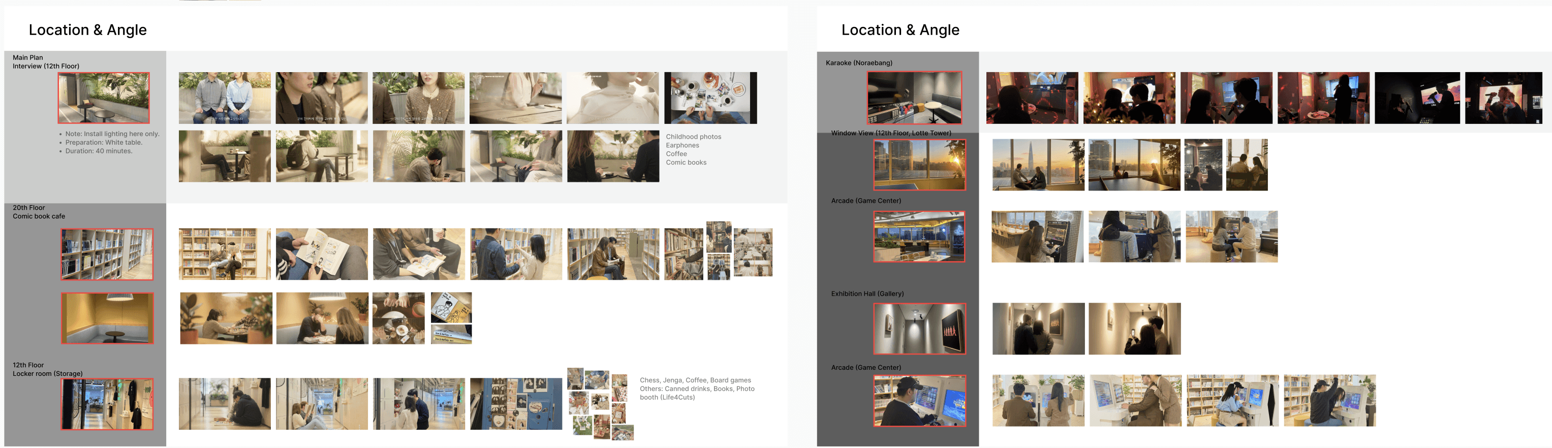
Art direction & post-production: visualizing "Frozen Time"
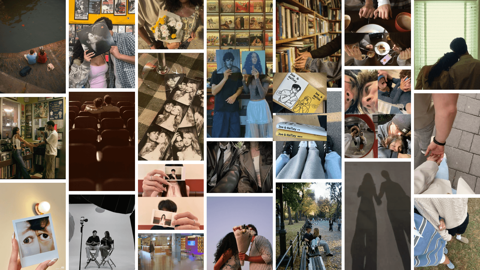


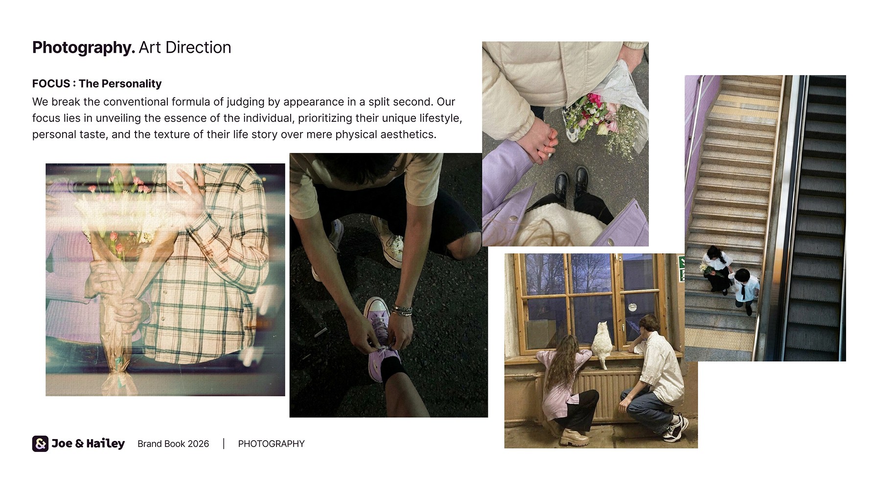
The Brand Book guidelines were applied strictly through the edit:
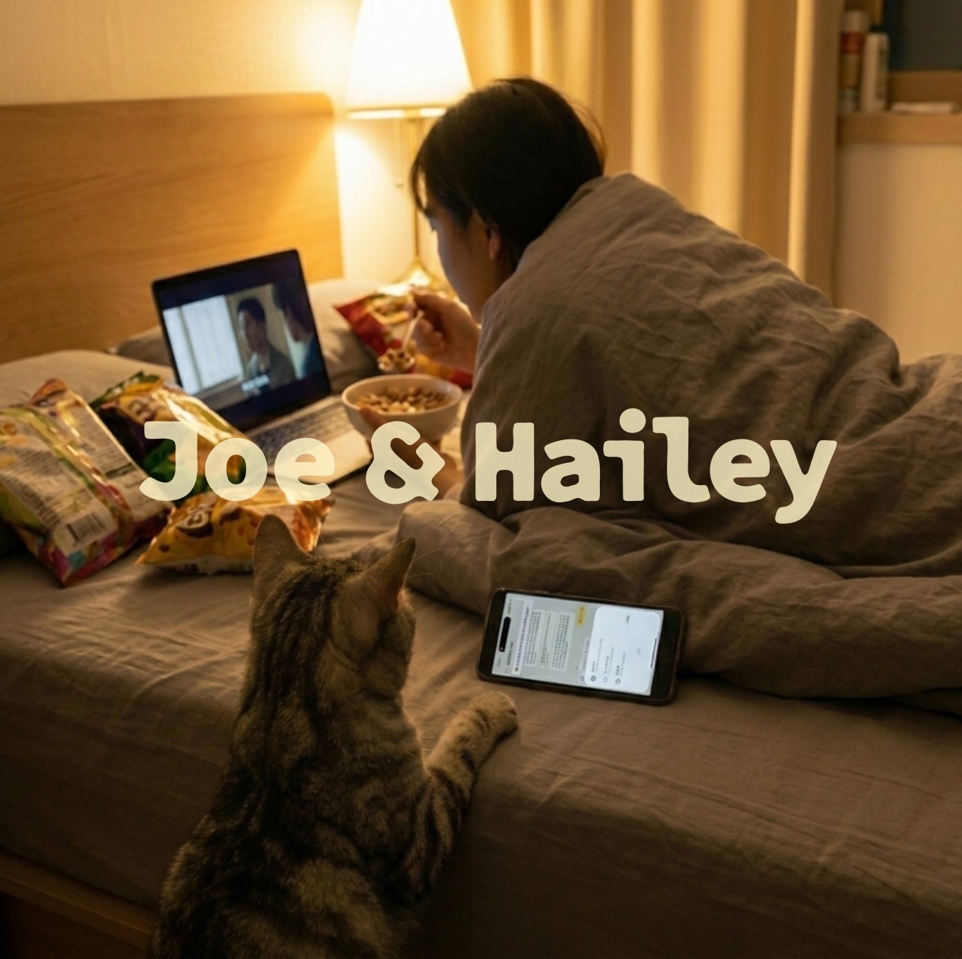
Cinematic tone : inspired by the intimate mise-en-scène of Your Romance, I maximized the harmony between natural light and the Buttermilk palette.
Typography : the brand's primary typeface, Sandoll CT Sans, for a sophisticated-yet-warm voice, paired with fast-paced layouts tuned for Gen Z.
The contrast : to visualize "the world is fast, but I want our time to stand still," background crowds run as time-lapse while the couple's interview stays still and vivid the Frozen Moment made literal.
Cutdown : I edited the footage into fast-paced 15-second ads and carousel sets, pairing the warm cinematic visuals with curiosity-inducing typography.
Results & Impact
Historic MAU Milestone: Drove the app to cross a major new Active User threshold for the very first time.
Targeted Virality: The 'manhwa café' narrative resonated deeply with the core 25-35 female demographic, resulting in sustained organic female user growth.
Delivered an exceptionally low CPR and secured a Day 7 retention rate that outperformed standard industry benchmarks by over 2x.
The moment data becomes romance comes not from a cold algorithm, but from the brand's warm, true details. This project proves a brand guide isn't merely a document, it's a strategic tool that turns a production constraint (privacy) into a highly engaging, unique brand asset through custom prop design.

Joe & Hailey Brand Book 2026 - full ver